Intro#
This is a guide, but it is also a note for me in case I forgot about how to do this again. This blog post is about how to build a custom UI component for a personal project without using third part UI component library such as Material UI, Chakra UI, Ant Design..., you get the idea.
Environment#
These are what I will be using in this guide.
TypeScript is required for the component props interface.
Tailwind CSS is optional, just my personal favorite. You can use any CSS frameworks or just good old vanilla CSS.
The clsx library is just a utility library for combining class names.
- Reac.js
- TypeScript
- Tailwind CSS (Optional)
- clsx (Optional)
Building the component#
Start with a basic component#
I will be using function component instead of class component in this example. If you ask why not class component, I will say why not function component? :D
const Button = () => {
  return <button>Click me!</button>;
};
export default Button;

Simple, just like that. Very basic.
Add some styles#
const Button = () => {
  return <button className="bg-blue-400 px-3 py-2 text-white font-bold rounded">Click me!</button>;
};
export default Button;

Now we got a styled button, not the best looking button in world, but it will do the job.
Add props#
Instead of passing a single (props) parameter, we will add type checking to the props, similar to the prop-types library, but we will be using TypeScript interface.
To start, we need to create an interface, you can put it in the same file with the component codes, or import from a .ts file contains the exported interface. I will put it in the same file with the component in this demo.
import React from "react";

interface ButtonProps {
  className?: string;
  children: React.ReactNode;
}
Note:
?:means this prop is option to pass,:means you must pass this prop.That means to use the
Buttoncomponent, we must pass in thechildren, and theclassNameis optional.
Use the props interface#
The are many ways that you can use it. I will show 2 normal ways that you can use the interface.
-
This is the simplest, type the props parameter, and we destruct the fields from the props instead doing
(props: ButtonProps).const Button = ({ className, children }: ButtonProps) => {/*...*/}; -
Type the component with
React.FC. It is the interface/type for React function component. This is usually optional for function components, React is smart enough to know a function is returning JSX. In this demo, we can use it to pass the interface to the component like below. This will also add the interface to the props.const Button: React.FC<ButtonProps> = ({ className, children }) => {/*...*/};
Now we can use the props in our component, and it looks like this:
const Button: React.FC<ButtonProps> = ({
  className,
  children,
}: ButtonProps) => {
  return (
    <button
      /* Combining the pre-defined classes and the className prop. */
      className={clsx(
        "bg-blue-400 px-3 py-2 text-white font-bold rounded",
        className
      )}
    >
      {children}
    </button>
  );
};
Additional props issue#
One downside of this is that you can't using native button functions like onClick without define it in the interface by doing something like below.
import React from "react";

interface ButtonProps {
  className?: string;
  children: React.ReactNode;
  onClick?: React.MouseEventHandler<HTMLButtonElement>;
}
What if we want to use onMouseDown? and onMouseUp? and many others? We can't use those function without defining them in the interface, that's too much work if each time we want to use a new native button function, we need to define a new field in the interface.
To solve this issue, we can extends these functions and native props of the button element by doing the following:
interface ButtonProps extends React.ButtonHTMLAttributes<HTMLButtonElement> {}
And now we can remove the className, children, and onClick fields from the interfaces, because they are already in the React.ButtonHTMLAttributes<HTMLButtonElement> interface. If you don't have any other custom props, you don't even have to create an interface, just type the props parameter like this ({className, children}: React.ButtonHTMLAttributes<HTMLButtonElement>).
You might be thinking, so how are we going to pass in all the native button functions? Do we have to destruct each one of them from the props and pass to the button component? That's a lot of work!
And the answer is "NO"! We can do something like this:
const Button: React.FC<ButtonProps> = ({
  className,
  children = "Button", 	/* Give a default button text this time */
  ...props
}: ButtonProps) => {
  return (
    <button
      className={clsx(
        "bg-blue-400 px-3 py-2 text-white font-bold rounded",
        className
      )}
      {...props}
    >
      {children}
    </button>
  );
};
We will first destruct all the fields that we want to use differently. Such as the className and children in the demo above. For the rest of all other props, we destruct them by ...props, and pass to the button element by {...props}.
Now we have a custom UI button with all the native button element props, and props type checking, and IntelliSense support by in editor such as Visual Studio Code. Nice!
Custom Props#
In some UI component library such as Material UI, they have custom props that can change the style of the component. You can do the same thing here by adding custom props.
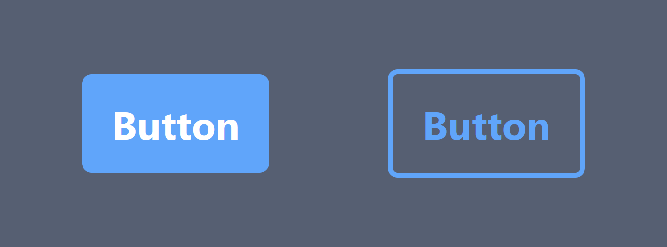
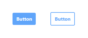
In the Material UI Button component, it has a props call variant, you can change it "contained" or "outlined", which it will change from filled with color to transparent background with a color border. We can do the same thing to added further customization to our button component.
First we need to add this custom field to the interface,
interface ButtonProps extends React.ButtonHTMLAttributes<HTMLButtonElement> {
  variant?: "contained" | "outlined";
}
By defining the interface like above, you can only pass "contained" or "outlined" to the variant prop.
Now the component code.
/* store the Tailwinds classes in an object with the variant options as object keys. */
const variants = {
  contained: "bg-blue-400 text-white",
  outlined: "border-2 border-blue-400 text-blue-400",
};

const Button: React.FC<ButtonProps> = ({
  /* We need to set a default value because `variant` is optional */
  variant = "contained",
  className,
  children = "Button",
  ...props
}: ButtonProps) => {
  return (
    <button
      className={clsx(
        "px-3 py-2 font-bold rounded",
        variants[variant],	/* pass the variant as a object key to load the classes */
        className
      )}
      {...props}
    >
      {children}
    </button>
  );
};
You can also create a '.contained' or '.outlined' in your CSS file, and just concatenate the variant prop to the className string. There are many ways to do it, this is just one of them.
End#
So, this is how you can create a TypeScript React UI component with all native html element props inherited, typed props interface, and props that can change the styles. Below it is the the full code for this demo button component.
Button.tsx
import clsx from "clsx";
import React from "react";

interface ButtonProps extends React.ButtonHTMLAttributes<HTMLButtonElement> {
  variant?: "contained" | "outlined";
}

const variants = {
  contained: "bg-blue-400 text-white",
  outlined: "border-2 border-blue-400 text-blue-400",
};

const Button: React.FC<ButtonProps> = ({
  variant = "contained",
  className,
  children = "Button",
  ...props
}: ButtonProps) => {
  return (
    <button
      className={clsx(
        "px-3 py-2 font-bold rounded",
        variants[variant],
        className
      )}
      {...props}
    >
      {children}
    </button>
  );
};

export default Button;